Watercolor With an Eye for Design
Ratindra Das
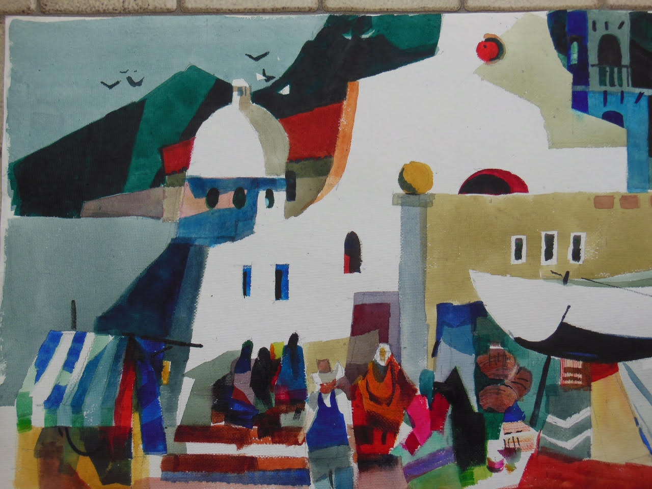
Ratindra Das
watercolor With an Eye for Design
May 1-4
9:30 AM - 4:00 PM
$400
“There is no better reason to paint than just for the love of it. I enjoy, I struggle and I exult. Sometimes I will not follow the norms and rules of watercolor. Those who write prose will go by the rules, poets will not. Painting is a visual poem” - Ratindra Das
Workshop Description:
The focus of this workshop is “design”-- not a “how to” do a watercolor. Those who are ready to step out beyond their standard way of working will benefit most. Design is deliberate. It’s more than just painting a pretty picture; it’s a “thinking process”. The design process will explore:
• Shapes and their relationships and placement on paper. Learn how to use drawings and photographs in a creative way.
• Explore lights and darks (values). Know the difference between “nature’s light” and “artist’s light”. Learn to use conceptual and ambiguous lights and value relationship with colors.
• Explore color in design. Learn how a color dominance (warm or cool) can achieve unity in a painting. Explore tertiary colors and their effects in painting.
• Add verve to your painting by movement, flatness, calligraphy and bold colors.
What to Expect from Instructor
1. Discussion and demonstration every day with audiovisual aids and illustrations.
2. Guidance to students during hands-on painting. Students will have about 50% time for painting.
3. A critique session every other day.
4. Painting subjects will be from objective world in a personal way. This will be primarily landscape in a broad sense (anything that touches land) and not figures, portraits, pets or animals.
What to Expect from Students
1. Home assignments will be given about 3 weeks ahead of time. Guidance will be included. 1/4 sheet studies of values and colors.
2. Reading: Rex Brandt and Robert Henri in The California Style by Gordon McLelland; Watercolor With an Eye for Design by Ratindra Das (optional)
3. Sketches, drawings and a few (no more than 10) photographs to paint from.
4. Enthusiasm.
About the Instructor:
RATINDRA DAS A.W.S. (DF), N.W.S, TWSA (DM)
www.RatindraDas.net
Ratindra Das is a Dolphin Fellow and a signature member of the American Watercolor Society. He holds a Distinguished Master status in the Transparent Watercolor Society of America. A signature member of National Watercolor Society and six other watercolor societies, he is recipient of numerous awards including eight in the American Watercolor Society. He was invited to exhibit in the 1st “Shanghai Zhujiajiao International Watercolor Biennial Exhibition” and in the exhibition of “ International Watermedia Masters in Nanjing, China”, “Taiwan World Watercolor Competition”, Republic of China. He has been appointed as Honorary Member of the Jiangsu Watercolor Research Institute. A popular workshop instructor and frequent juror of shows and competitions, he has served as a selection juror for the American Watercolor Society and many other national exhibitions. He has conducted workshops and seminars throughout the US, Mexico, Canada, Italy, Singapore and China .He frequently gives demonstrations to general public as well as artists’ groups.
Ratindra recently published his second book, Watercolor With an Eye for Design. His first book, Watercolor Beyond Obvious Reality, is still available through his website www.RatindraDas.net.
He has been featured in several books and magazines and was included in a featured article titled “Break the Rules” in Watercolor Magazine, by American Artist, in “Workshop 101” in Watercolor Artist, and in Best of America Watermedia Artists, Volume 2. He produced a workshop video titled “Painting a Personal Reality in Watercolor”. He is represented by the Blue Dolphin House and Gallery in Ephraim, Wisconsin; Mullaly’s 128 Gallery in Elk Rapids, Michigan; and Li Fine Art Gallery in Singapore.
Signature Membership
Dolphin Fellow /American Watercolor Society, National Watercolor Society,
Transparent Watercolor Society of America (Distinguished Master Status), Northwest Watercolor Society, Mississippi Watercolor Society, Watercolor West, Rocky Mountain National Watermedia Society, North East Watercolor Society
Honorary Member, Jiangsu Province Watercolor Research Institute, China; Montana Watercolor Society; Illinois Watercolor Society.
Awards (National and Regional)
American Watercolor Society, Adirondack National, Rocky Mountain National Watermedia, San Diego Watercolor Society International, National Watercolor Society, Watercolor USA, Watercolor West, Midwest Watercolor Society Award, Arizona Watercolor Association, Pittsburgh Watercolor Society, Pennsylvania Watercolor Society, North East Watercolor Society, National Watercolor Oklahoma Award, Northwest Watercolor Society Award, Texas Watercolor Society, Montana Watercolor Society
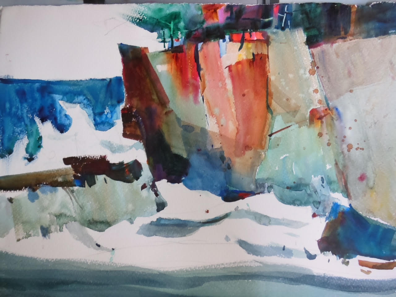
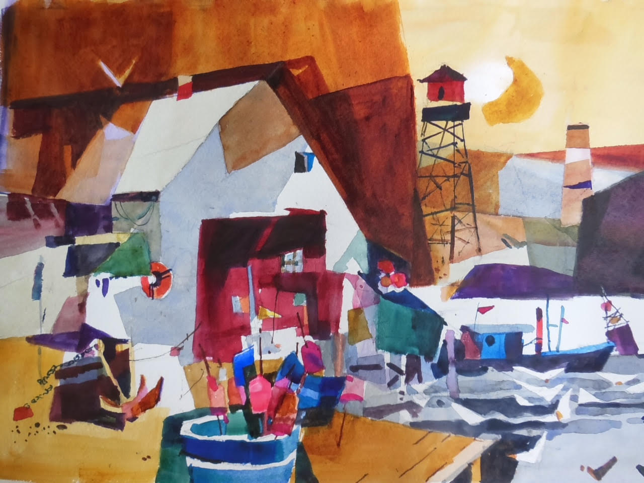
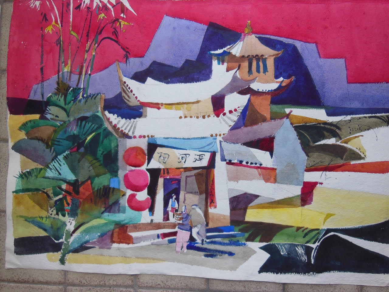
Visit www. RatindraDas.net to see examples of his work
Abbreviated Supply List for Workshop:
• #140 cold press watercolor paper ( D'Arches, Moulin du Roy, Saunders, Richeson , Lana)
I do not recommend blocks. If you have block, you will have to take single sheets out of the block. We’ll be working mostly on half sheets. You may be cut in halves or quarters in the class.
• Paper support- a non absorbent surface -same size of the paper or slightly larger ( a masonite board with at least 3 coats of glossy paint, or plexiglas, or
• 'Gatorboard' Homasote board or plywood WILL NOT work for some of the procedures .Unpainted masonite board will absorb moisture too quickly and unevenly and is not recommended. Recently I found a material in HomeDepot called marker board . Cost for 4’x8’ is about $15. They will cut it to small sizes. If you pool together it is the most reasonable material. Gatorboard costs $16 for a 16”x23” board.
• Sketchbook or loose sheets of paper for drawing and sketching. I do not use photographs too often.
• PALETTE: Many watercolor palettes are available in the market. Do not bring little inexpensive plastic palettes. I like a folding pallete made by a company “Mijello”. You will be using a lot of paint.
• BRUSHES: A good 1” flat Flat brush is the workhorse.( Grumbacher Aquarelle #6142, or Morilla #202) I use ‘Isabey’ and Richeson sable flat. A round #10 or #12. Also a small round brush, or a rigger is very helpful. Over the years I have replaced all my synthetic brushes with natural hair brushes. But they are more expensive!
DO NOT BUY SET OF BRUSHES. Most of those brushes are useless.
• An easel, if you have one. Or, a camera tripod which can be converted to an easel. But you must let me know in advance so I could tell you how to do it. You will be painting more or less in an upright position of the board.
• A discarded terry towel- not paper towel
• Plastic water container-large mouth
• A very soft pencil -6B or softer.
Colors:
Quinacridone Gold _-an absolute must. There is no SUBSTITUTE. Daniel Smith is my choice.
Opera, or Opera Rose, or Quinacridone Rose. You may try “Fuschia” by American Journey
Thalo Blue
Ultramarine Blue
Cobalt Blue
Viridian Green (not Hue)
Alizarin Crimson
Cobalt Turquoise
Since this is a very limited palette, do not buy cheap variety of colors. DO NOT TAKE PAINT OUT OF TUBES IN ADVANCE. YOU NEED FRESH PAINT before starting to paint. SPRITZING WITH WATER WILL NOT WORK!!
OPTIONAL
Quinacridone Burnt Orange (Daniel Smith), or Quinacridone Rust (M.Graham)
Thalo Green
Miscellaneous:
A kitchen sponge(cellulose type), or rags , bull-dog type clips (2)
Here’s my full palette for those who are interested in pursuing further.
****Winsor Blue (Red shade)
Manganese Blue( Holbein), or Cerulean Blue (W/N or Quiller by Richeson)
****Cobalt Blue (W/N)
****French Ultramarine Blue (W/N or M. Graham or Quiller)
****Viridian Green (W/N or M.Graham). Viridian Green Hue is not the same.
Winsor or Thalo Green
****Quinacridone Gold ( will be extensively used) There is no substitute.
Yellow Ochre(optional.I use it only occasionally)
Quinacridone Red
****Alizarin Crimson (W/N or Graham)
****Opera (Holbein).Note: Recently I found a tube of Rose Opera by Winsor Newton. Seems to be an excellent substitute.
**** Quinacridone Burnt Orange(Daniel Smith).There is no good substitute
Cobalt Turquoise Light(W/N)-most recent addition to my palette. or Andrew’s Turquoise by Cheap Joes
Colors marked **** are the colors that I use most of the time and are recommended. Payne’s Gray is a good companion color for those who just like to stay within a limited palette.
About PHOTOGRAPHS
Although one day I will show how to interpret photographs, generally I work from my sketches. Do not bring stacks of photographs. No more than 8 or 10 . Avoid the ones where there are large panoramic views, pictures of family or pets.. Subjects are everywhere- we just have to develop our eyes to see! I’ll give you reference photographs if wish to paint from them.
If there are any questions, please do not hesitate to call or e-mail RatindraDas@sbcglobal.net